
Ark.ai's Network Navigator — a graph-based intelligence workflow that transforms how SCRM Analysts uncover risks, surfacing hidden multi-tier vulnerabilities through interactive network visualization.
Role
Lead Product Designer and Researcher
Tools
Figma, FigJam, Lucid, V0
Team
2 PMs, 2 Data Scientists, 3 Engineers
Timeline
June 2025 – December 2025
Supply Chain Risk Management Analysts needed to identify hidden vulnerabilities across multi-tier supplier networks, but existing database tools required hours of manual queries to trace entity relationships. Analysts couldn't visualize how risks cascaded through their industrial base or quickly respond to leadership requests for information. Through extensive research with SCRM Analysts and collaboration with Implementation Engineers, I designed Network Navigator — a graph-based intelligence workflow that surfaces hidden multi-tier vulnerabilities through interactive visualization, enabling analysts to investigate supply chain risks in minutes instead of hours.
The Challenge
SCRM Analysts spent hours running multiple queries in disparate databases, often relying on data scientists to write custom searches for complex scenarios. Spreadsheets couldn't reveal which suppliers were single points of failure, and static reports couldn't predict how a geopolitical event halfway across the world would ripple through their network. What should have been proactive risk management had become reactive crisis response — investigations that should take minutes stretched into multi-hour processes, leaving critical vulnerabilities unaddressed until they became emergencies.
The Objective
Through research with SCRM Analysts and collaboration with Implementation Engineers, we determined the need to design and ship a graph-based intelligence workflow that transforms how supply chain risk analysis is performed. The workflow needed to surface hidden vulnerabilities through interactive visualization, enabling analysts to explore entity relationships, identify risk clusters, and complete investigations in minutes — eliminating the need for extensive manual database queries.
We began by conducting interviews with our deployment Implementation Engineers who work onsite with SCRM Analysts 3–4 days per week. Through these initial conversations and analyses of existing client workflows, we identified two distinct analyst personas with different needs and use cases.
HQ Analysts
Laser-focused on keeping specific programs on schedule and budget by identifying supplier vulnerabilities before they become disruptions. They leverage network analysis to rapidly answer RFIs from directors and find vulnerabilities within their supply chain that could cause disruption.
Program-Led Analysts
Strategic oversight analysts who need to instantly see how a single risky supplier could cascade into program delays and cost overruns across their industrial base. They use nodal analysis to brief leadership with exported risk summaries that quantify systemic risk impact and cross-program exposure.
Through shadowing sessions with IEs and workflow analysis of both analyst types, we discovered that existing database tools forced both personas into inefficient, fragmented workflows that undermined their core responsibilities.
Time-Intensive Manual Mapping
Analysts spent hours manually tracing supplier relationships tier-by-tier, missing indirect risks that could cause disruptions.
Hidden Dependencies Go Undetected
Current tools couldn't detect hidden risks and dependencies across multiple supplier tiers, leaving vulnerabilities unaddressed.
Different Roles, Different Needs
HQ Analysts need quick tactical answers while Program-Led Analysts need strategic oversight — one interface must serve both.
These findings defined our design requirements: build a graph visualization workflow that could instantly surface multi-tier supplier vulnerabilities for HQ Analysts responding to rapid-fire RFIs, while simultaneously providing Program-Led Analysts the systemic network views needed for leadership risk briefings.
Based on these insights, we mapped the core analyst investigation workflow that both personas follow: select an entity of interest → explore network relationships → identify vulnerabilities → share findings. While HQ Analysts use this flow for rapid RFI responses and Program-Led Analysts apply it to broader systemic analysis, the fundamental interaction pattern remained consistent.
Network Navigator · Analyst Investigation Workflow Map
After solidifying the conceptual maps, I began exploring how to translate database relationships into an intuitive graph interface. Early concepts tested different approaches: Should analysts start with a search query or a visual overview? How do we surface risk indicators without overwhelming the network view? What interaction patterns enable seamless traversal across multiple relationship tiers?
Through iterative wireframing, I balanced visual clarity with the density of multi-tier supplier data, ensuring HQ Analysts could quickly drill into specific entities while Program-Led Analysts could zoom out to see systemic patterns.
Lo-fi Exploration
Network Navigator · Lo-fi Interaction Explorations
As designs evolved from lo-fi to hi-fi, I conducted validation sessions with Implementation Engineers and SCRM Analysts to test core interaction patterns. These sessions revealed critical refinements needed to support both investigation modes.
Design Iterations
01 — Applying Filters
02 — Expanding Connections
03 — Incorporating Data Table
Key Feedback
Robust Filtering in Context
Analysts needed granular filters accessible directly within the graph view to narrow relationships by risk type, entity attributes, or connection strength without disrupting their investigation flow.
Contextual Expansion Controls
'Expand by Risk' and 'Expand by Relationship' options needed to be contextual to each entity, allowing analysts to explore different connection types based on their current investigation focus.
Data Table Integration
For dense networks, analysts needed a complementary table view showing detailed entity metrics alongside the visualization — enabling pattern identification while maintaining the graph's spatial context.
As we moved from prototype to implementation, two critical challenges emerged that required design adaptation.
Pivoting the Technical Approach
Initial development used Sigma.js as our rendering library, but testing revealed critical gaps: the library didn't support lasso selection, click-and-drag manipulation, or badge components on cluster nodes — all essential for the analyst workflows we'd validated. This led us to pivot to D3.js, a more flexible rendering library that could support these interaction requirements.
Incorporating Accessibility
Given the complexity of graph interactions, I partnered with engineers to design comprehensive keyboard navigation patterns aligned with WCAG 2.1 — ensuring analysts using assistive technologies could traverse networks, expand nodes, and access filtering controls without a mouse.
Keyboard Shortcuts & Interaction Reference
Canvas Controls
Selections & Edits
Mouse & Tools
Through iterative design, technical pivots, and continuous validation with Implementation Engineers and DoD SCRM Analysts, we launched Network Navigator — a workflow that transformed how supply chain analysts investigate vulnerabilities across defense industrial base suppliers.
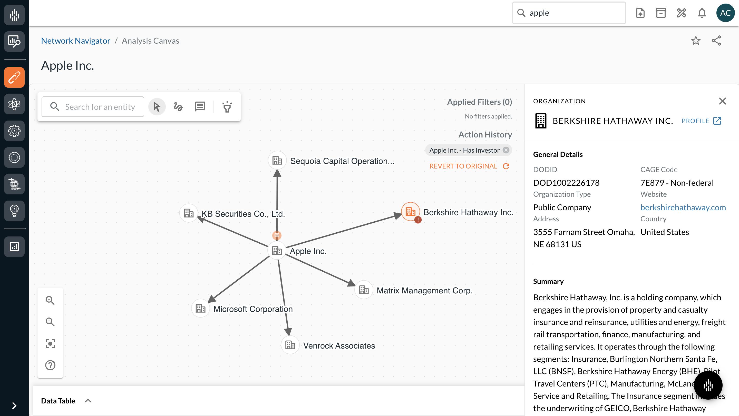
Visual Intelligence Through Interactive Graphs
Analysts can click any entity to view comprehensive summary cards with key risk indicators, financial health metrics, and compliance information — providing immediate context without leaving the graph view.
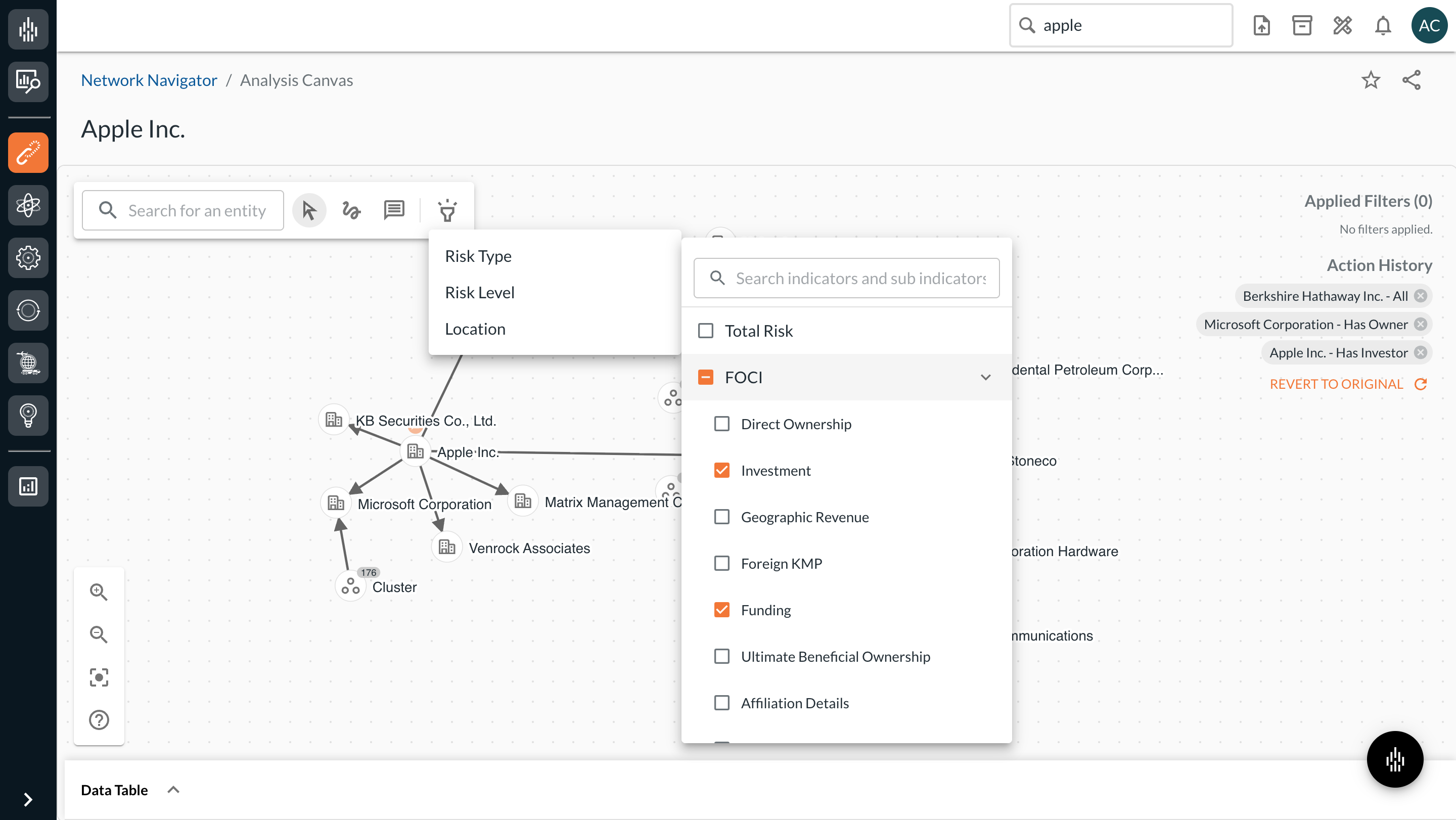
Contextual Exploration and Risk Analysis
Analysts can filter the graph directly from the data table, with active filters surfaced as visual indicators on the graph itself. This closed-loop between table and visualization keeps analysts oriented — filter state is never hidden in a panel, it's legible in the canvas.
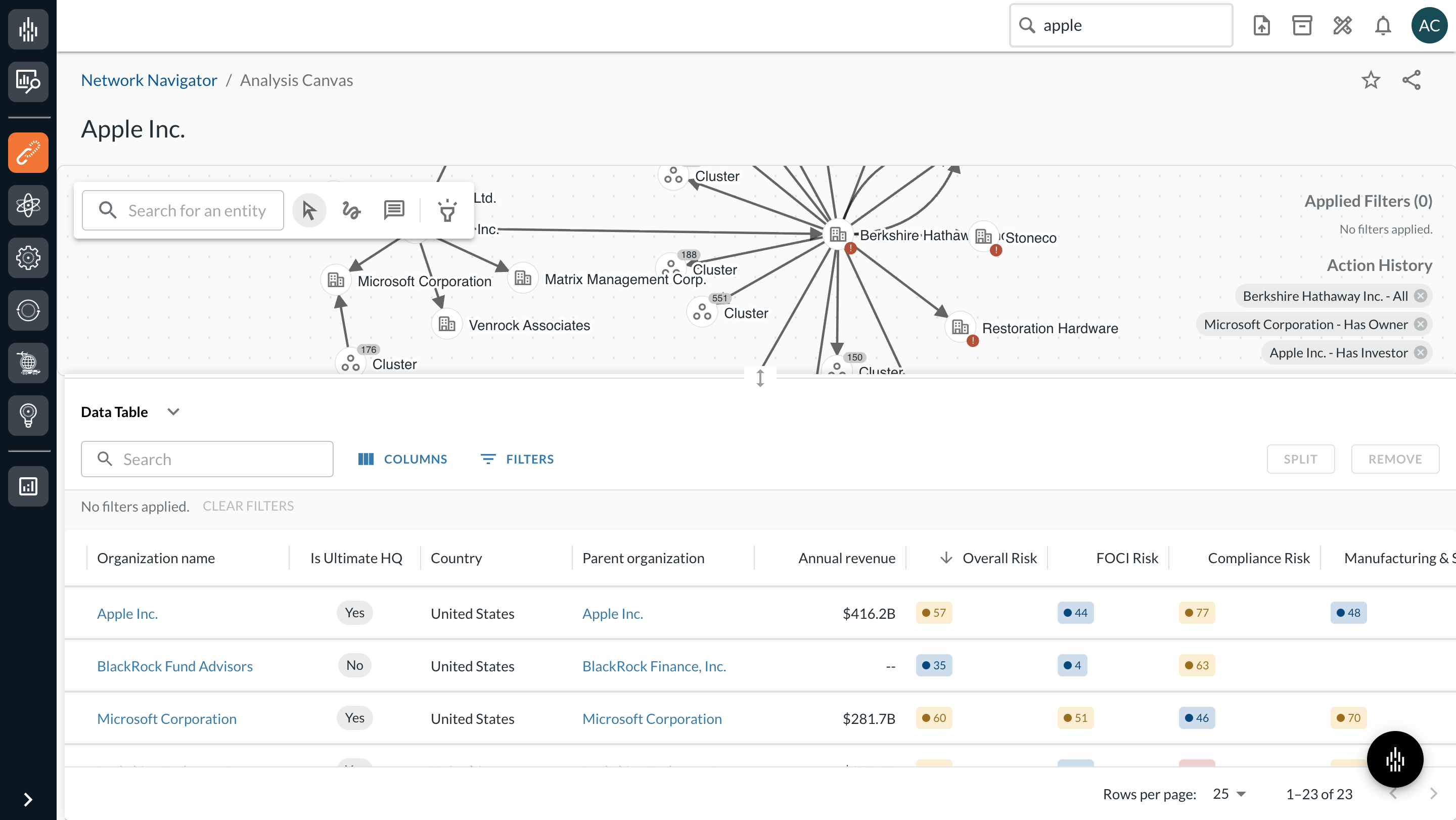
Data Table Integration for Dense Graphs
When graphs contain many nodes, the integrated data table provides a synchronized view of entity details and metrics. Analysts can explore information in tabular format, sort and filter data, and identify patterns that might be harder to see in the visual network — making it easier to extract insights and export findings for reporting.
Network Navigator launched to 5 customer deployments and quickly became an essential tool for SCRM Analysts. The pilot validated the need for visual supply chain intelligence and demonstrated strong user engagement and positive feedback.
The team actively responded to user feedback and bugs while shipping version 1.1 updates, demonstrating strong traction and the potential for expanded deployment across additional customer organizations.
155
Analyses Conducted
in the first 30 days
20%
Increase in WAU
across pilot deployments
5/5
Positive Sentiment
from pilot deployments
"It is landing with clients. We had demos with 3 deployments in the last two days where it demoed incredibly well and user feedback was incredibly positive. 'This is what I was expecting from Ark.ai when we were first sold it.'"
Implementation Engineer, Ark.ai